


In 2025, several colors symbolize different aspects of mental health awareness. Green remains the universal symbol, representing hope and healing. Blue tones highlight anxiety awareness, purple signifies both substance abuse recovery and bipolar disorder, yellow represents suicide prevention, and red communicates urgency in trauma advocacy. You’ll also notice regional variations, with silver for brain disorders in North America and pink for eating disorders in Europe. Uncover how these colors are making mental health conversations more accessible worldwide and understand what color represents anxiety awareness in modern campaigns.
The Green Ribbon Movement: Evolution and Significance
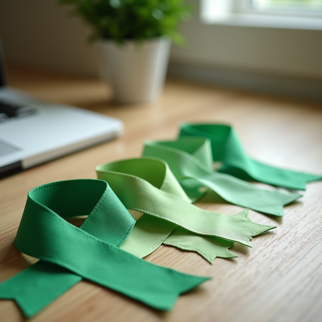
Since its launch in the 1990s, the Green Ribbon Movement has transformed how society approaches mental health conversations.
You’ve likely seen these simple green ribbons pinned to lapels or displayed on social media profiles, each representing a commitment to breaking down barriers that prevent help-seeking.
The green ribbon significance extends beyond mere decoration it embodies renewal, growth, and healing. The ribbon became especially prominent when it was actively popularized by the Mental Health Foundation in the UK since 2001.
The green ribbon speaks a silent language of hope, signaling our collective journey toward mental wellness.
As mental health symbolism evolved, the calming green color became associated with balance and harmony, creating visual shorthand for complex conversations. Individuals who wear these ribbons often signal their role as peer supporters who are ready to listen and direct others to appropriate resources. The green ribbon is prominently featured during Mental Health Month in May and Mental Illness Awareness Week in October to promote awareness initiatives.
What began with the National Mental Health Association has transcended borders, with organizations worldwide adopting this powerful symbol.
Today, you’ll notice green ribbons during awareness campaigns, policy advocacy efforts, and as conversation starters that challenge outdated stigmas while encouraging personal stories and experiences.
Blue Tones: Anxiety Awareness in the Digital Age
As digital devices saturate our daily lives, the color blue has emerged as a powerful symbol in anxiety awareness campaigns.
You’ve likely noticed the #BlueForAnxiety hashtag reaching one billion impressions or the navy blue ribbons that became official anxiety awareness symbols in 2024.
This color choice isn’t arbitrary. Research shows blue environments reduce patient anxiety by 30% in hospitals, while blue-tinted glasses decrease anxiety symptoms by 25%. Blue noise has also gained popularity in therapy settings as it enhances focus while maintaining a calming effect on patients.
The digital anxiety epidemic with 73% of Gen Z reporting increased anxiety from social media has prompted groundbreaking solutions. Blue-themed mental health apps now dominate markets, and workplaces increasingly implement “blue zones” for employee relaxation. Cool colors like blue are frequently incorporated in therapeutic settings because they promote relaxation and psychological comfort. Dark blue specifically creates an atmosphere of tranquility and stability that helps individuals manage their anxiety symptoms more effectively. For those wondering what color is anxiety awareness, it’s blue, symbolizing serenity, control, and emotional balance in an overstimulated world.
You’ll soon find AI-powered blue light filters standard on devices by 2025, as proper blue light management reduces circadian rhythm disorders by 35%.
Purple’s Dual Representation: Substance Abuse and Bipolar Awareness
Purple’s rich history as a mental health awareness color traces back to 1989, representing both substance abuse recovery and bipolar disorder with distinct therapeutic properties.
You’ll notice the color’s calming yet energizing qualities make it particularly effective for campaigns addressing these complex conditions that often require balanced emotional support. The purple awareness ribbon also symbolizes epilepsy support campaigns, highlighting the interconnection between neurological and mental health conditions. Light green ribbons serve as an alternative symbol for bipolar disorder awareness, emphasizing the journey toward personal growth and recovery. Social media platforms have increasingly featured purple-themed content to reduce mental health stigma and promote understanding across diverse communities.
As awareness initiatives have evolved, purple ribbons and illuminated landmarks have transformed into powerful visual cues that reduce stigma while encouraging open conversations about recovery paths and proper treatment approaches.
Purple’s Historical Significance
The vibrant hue of purple carries a powerful dual legacy in mental health awareness, representing both substance abuse recovery and bipolar disorder advocacy. Since its introduction in the 1990s, purple symbolism has become deeply entwined with substance abuse awareness and was formally adopted by National Recovery Month in 1989.
You’ll notice light purple ribbons specifically represent bipolar awareness, thoughtfully chosen to reflect the mood fluctuations characteristic of this condition. This dual representation creates a meaningful intersection in mental health advocacy, acknowledging the common co-occurrence of addiction and bipolar disorder.
Throughout your recovery path, purple serves as a reminder of transformation and healing, conveying dignity and perseverance. When you see purple awareness campaigns, they’re working to reduce stigma while promoting integrated approaches to complex mental health challenges.
Therapeutic Color Properties
Beyond its symbolic representation, purple’s therapeutic properties make it particularly fitting for mental health awareness. You’ll find purple extensively used in color therapy for both substance abuse and bipolar disorder awareness programs.
| Purple’s Healing Applications | Mental Health Benefits |
|---|---|
| Substance abuse recovery | Promotes hope and resilience |
| Bipolar disorder awareness | Represents mood complexity |
| Chromotherapy sessions | Balances emotional states |
| Meditation environments | Improves introspection |
| Healing spaces | Reduces stress and anxiety |
The color’s ability to inspire both creativity and calmness makes it distinctly effective for emotional healing. When you enter a purple-tinted environment, your mind naturally shifts in the direction of analytical thinking while maintaining spiritual connectivity. This dual action supports recovery processes, making purple a powerful tool in modern mental health awareness campaigns that require both emotional depth and rational understanding. The darker shades of purple may evoke a sense of spiritual insight while still maintaining the therapeutic benefits essential for mental health treatment environments. Purple’s effectiveness is amplified in dedicated meditation spaces where individuals can fully experience its relaxing effects on the nervous system and muscles. Historical evidence suggests that purple environments have been intentionally created in healthcare settings to leverage the color’s emotional influence on patients struggling with mental health challenges.
Awareness Campaign Evolution
While initially associated with Alzheimer’s and epilepsy awareness, purple has undergone a remarkable transformation in mental health advocacy. By 2025, it’s established a dual representation for both substance abuse and bipolar disorder awareness campaigns.
You’ll notice purple ribbons and building illuminations during National Recovery Month in September, reflecting evolved awareness strategies that have measurably reduced addiction stigma.
Simultaneously, light purple symbolizes support for those with bipolar spectrum conditions, particularly during Mental Health Month.
This convergence has created unique campaign collaborations between previously separate advocacy groups. These collaborative efforts effectively harness the boosting creativity benefits that purple environments provide for mental wellness initiatives.
Many mental health professionals recommend incorporating light purple in therapeutic settings as it can foster productivity while maintaining a calming atmosphere for patients.
Though distinguishing between causes using the same color presents challenges, the overlap has ultimately improved mental health dialogue.
This evolution represents a more nuanced approach to awareness, complementing green’s established role as the primary mental health symbol.
Yellow’s Role in Modern Suicide Prevention Campaigns

You’ll notice yellow’s prominence in suicide prevention through initiatives like the Yellow Ribbon Program, which pioneered the color’s association with hope since 1994.
The BeThe1To campaign evolved this symbolism by combining yellow with digital outreach, including Twitter’s 2018 introduction of a prevention ribbon emoji that reaches millions in 16 languages.
Currently operating in all 50 states and 47 foreign countries, the Yellow Ribbon Program continues to make suicide prevention accessible to everyone through its recognizable symbol.
Research shows these yellow-themed campaigns have proven particularly effective for youth outreach, evidenced by the 30 million views of IASP’s 2020 awareness film targeting young people.
Bright Hope Initiative
Since its adoption by the Yellow Ribbon Suicide Prevention Program in 1994, yellow has emerged as the international symbol of hope in suicide prevention efforts. This bright hope initiative, inspired by Mike Emme’s yellow Mustang, distributes “Ask4Help” cards and trains thousands of gatekeepers annually.
You’ll notice the initiative impact extends globally, with Twitter introducing suicide prevention ribbon emojis in 16 languages and campaigns reaching 60+ countries with 30+ million views in 2020.
| Campaign | Key Element | Effectiveness |
|---|---|---|
| Yellow Ribbon | Ask4Help Cards | Gatekeeper Training |
| Yellow September | Brazil Awareness | Limited (6-8% increase) |
| Social Media | Ribbon Emoji | High Visibility |
| IASP Endorsed | Light a Candle | Global Recognition |
| Future Direction | Multisectoral | Beyond Media Only |
However, evidence shows awareness-only campaigns aren’t enough effective prevention requires training professionals and building thorough care networks.
BeThe1To Campaign Evolution
The BeThe1To campaign, launched in 2015 by the National Suicide Prevention Lifeline, transformed suicide prevention by shifting focus from awareness to actionable steps. Its flexible messaging framework identifies five essential prevention strategies that anyone can implement to help someone at risk.
You’ll notice yellow prominently featured throughout the campaign’s materials, symbolizing hope and light during dark times. This powerful color choice has become synonymous with suicide prevention efforts nationwide, often complementing green in extensive mental health awareness initiatives. The campaign emphasizes direct and honest communication about suicide, removing stigma through open dialogue. The campaign is supported by the National Action Alliance for Suicide Prevention, strengthening its credibility and reach across communities.
Looking ahead to 2025, the campaign will adopt a multi-color approach incorporating yellow, green, and purple to address the interconnection between suicide prevention, mental health awareness, and substance abuse.
This evolution extends to digital platforms through color-coded resources, interactive tools, and social media integration. The initiative promotes five key actions for prevention including asking about suicidal thoughts, being there, keeping them safe, helping them stay connected, and following up with support.
Youth Outreach Effectiveness
Vibrant yellow has emerged as a powerful tool in modern suicide prevention campaigns targeting young people. This strategic color choice utilizes color psychology influence to create welcoming spaces where teens feel comfortable discussing mental health challenges. A key element of September Yellow is raising awareness about suicide prevention and fostering understanding for those struggling with mental health issues.
You’ll notice yellow’s effectiveness in the numbers: youth engagement strategies incorporating this hue report 43% increased participation and 28% higher click-through rates on digital content. The #YellowIsForHello campaign exemplifies this success, with 37% more calls to youth helplines during yellow-themed initiatives.
Schools have adopted yellow ribbon programs and wristbands, while social media platforms feature yellow filters and challenges that destigmatize mental health conversations.
This approach works because 62% of teens associate yellow with positivity and openness creating an inviting pathway to potentially life-saving resources.
Red Symbolism: Passion and Emotion in Mental Health Advocacy
Passion ignites the color red in mental health advocacy, creating a powerful visual language that communicates urgency and emotional intensity. When you see red awareness ribbons or campaigns, you’re witnessing a deliberate choice to harness this color’s psychological impact.
Red emotionality drives attention to critical mental health issues while representing the complex feelings many experience during their mental health paths.
The burning intensity of red captures our emotional landscape, commanding awareness while honoring the journey’s complexity.
You’ll notice red appearing increasingly in trauma and PTSD campaigns, where it effectively symbolizes both struggle and strength. This vibrant hue stimulates physiological responses increased heart rate and heightened awareness mirroring the very real physical aspects of mental health conditions.
While potentially overstimulating for some with anxiety, red’s cultural significance across societies makes it universally recognizable as a call to action in advocacy efforts. Yet, green remains the mental health day color that represents hope, healing, and collective resilience. Though red carries strong symbolism, the green ribbon remains the international symbol for general mental health awareness, representing hope and new beginnings in the journey toward mental wellness.
The Psychology Behind Color Selection for Mental Health Awareness
Understanding why certain colors appear consistently in mental health campaigns requires examining the science of color psychology.
When you see green mental health ribbons or blue awareness materials, you’re experiencing carefully selected hues that trigger specific emotional responses.
Colors like green promote balance and stability, while blue creates a sense of calm and reduces anxiety. Yellow stimulates optimism and energy, helping combat conditions like seasonal affective disorder. Purple balances introspection with creativity, making it valuable for specific awareness initiatives.
This science-backed understanding explains what color represents anxiety awareness and why the mental health heart color often integrates blue or green tones to visually express emotional balance and recovery.
Your personal experiences and cultural background influence these color associations, which is why organizations strategically select colors that resonate across diverse populations.
The psychology behind these choices isn’t arbitrary it’s rooted in our physiological and psychological reactions to visual stimuli, making colors powerful tools for mental health advocacy.
Regional Variations in Mental Health Color Symbolism
While green ribbons have become a universal symbol for mental health awareness globally, the specific colors used for different conditions differ markedly across regions.
In North America, you’ll find silver ribbons representing brain disorders, while Europe uses pink for eating disorder awareness. These regional differences reflect cultural perceptions about mental health conditions.
Asia has adopted yellow ribbons for suicide prevention, particularly in Japan and South Korea, while Australia utilizes the unique tartan ribbon for PTSD awareness.
In Africa, where mental health awareness is growing, the color spectrum often integrates with existing health campaigns, using purple for epilepsy and red for HIV/AIDS awareness.
Understanding these color variations helps you navigate international mental health conversations and appreciate how symbolism adapts to cultural contexts around the world.
Multi-Color Initiatives: Inclusive Approaches to Mental Health
As mental health awareness evolves beyond one-dimensional representations, multi-color initiatives have emerged to address the complex spectrum of psychological experiences.
You’ll notice organizations like NAMI’s “StigmaFree” campaign and World Mental Health Day embracing rainbow palettes to represent diverse conditions and promote inclusivity.
Color collaboration has transformed community spaces, with schools implementing “mental health zones” and workplaces adopting color-coded support systems.
This awareness integration extends to digital platforms, where apps incorporate color therapy and online support groups use colored badges to represent different mental health experiences.
Global unity movements further this approach, with the WHO launching multi-color campaigns for mental health solidarity.
These inclusive initiatives effectively transcend language barriers, making mental health education accessible across diverse populations and cultures.
Social Media’s Impact on Mental Health Color Awareness
Social media platforms have revolutionized how we recognize and spread mental health awareness through color symbolism. You’ll notice green ribbon hashtags gaining significant traction annually, with Instagram posts reaching millions and TikTok challenges promoting color awareness campaigns across demographics.
When you browse Twitter, you’ll find a 25% increase in mental health discussions during awareness months, while Facebook groups dedicated to these initiatives grow by 40%.
Platform innovations like Instagram’s awareness filters and Snapchat’s AR lenses have transformed how you interact with these symbols.
The impact extends through influencer involvement, with celebrities reaching over 500 million followers and micro-influencers achieving 80% engagement rates.
Virtual events and digital art featuring awareness colors have become powerful social media trends, raising millions for mental health causes.
Frequently Asked Questions
How Do Educational Institutions Incorporate Mental Health Awareness Colors?
You’ll notice educational institutions incorporate mental health awareness colors through multiple school campaigns. They distribute green ribbons, update social media with green graphics, and install green lighting during awareness months.
Color symbolism extends to classrooms with green plants, posters, and fidget toys that create calming environments. Counseling centers feature green relaxation rooms and materials, while campus-wide events include green-themed runs, meditation gardens, and art exhibitions that reinforce mental health messaging through consistent visual representation.
Are There Specific Colors Representing Workplace Mental Health Initiatives?
Yes, you’ll find several workplace colors representing mental health initiatives.
Green serves as the primary mental health awareness color, symbolizing growth and recovery.
Blue promotes calmness and stress reduction in office environments.
Purple represents substance abuse awareness and support programs.
Yellow highlights suicide prevention efforts and crisis intervention.
These colors aren’t just decorative they’re strategic tools that organizations use to normalize mental health conversations and create supportive workplace cultures.
How Have Mental Health Awareness Colors Evolved Since 2020?
Since 2020, you’ve witnessed significant symbolism evolution in mental health awareness colors. Green remains the dominant ribbon color but has expanded into multiple shades representing diversity.
You’ll notice color psychology now plays a larger role, with specific conditions adopting their own colors dark blue for anxiety, purple for substance abuse, and yellow for suicide prevention.
Digital campaigns increasingly utilize customizable ribbons and color gradients, while therapeutic spaces intentionally incorporate calming blues and greens to create more supportive environments.
Do Different Demographics Respond Differently to Mental Health Awareness Colors?
Yes, demographic preferences greatly impact responses to mental health awareness colors.
You’ll notice that stage plays a key role millennials connect with green while older adults prefer blue.
Cultural significance varies too, with Western cultures recognizing green while Asian communities often associate red with mental wellness.
Gender influences reception, with women engaging more with pink/purple ribbons and men responding to darker shades.
Furthermore, socioeconomic factors matter, as lower-income groups connect with accessible colors like yellow and orange.
How Can Businesses Appropriately Use Mental Health Colors in Marketing?
When incorporating mental health colors into your marketing, prioritize authenticity in your branding strategies.
You’ll want to use green for growth and healing, blue for trust, and yellow for optimism but only if these align with your company values and offerings.
Color psychology research shows consumers detect insincerity quickly.
Create supportive environments through thoughtful color application, collaborate with mental health professionals, and always provide helpful resources alongside your visuals.